Tuesday, November 30, 2010

Memento - Opening Sequence Analysis


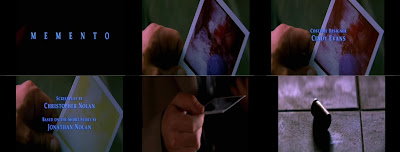
This is the opening sequence of the movie 'Momento', directed by Christopher Nolan; created in 2002.

The title of the film:
The title of the film is shown to us near the beginning of the film opening, as the title ‘Memento’ appears in blue letters; allowing an easy viewing due to the black background. The titles fade in and out, creating an eerie and creepy atmosphere, which is what you feel for the whole duration of the movie. The actors, and various members that were included in the film are shown in the opening sequence, and this happens quite slowly. A title sequence is traditionally slow paced, which is what this opening sequence is; again an eerie atmosphere has been created due to this decision made.

Setting/Location:
The viewer is able to see the location at which this movie is set shortly after we see the ‘Memento’ title fade out, and we are shown a close up shot of a hand holding a Polaroid picture. Initially, we want to know more, why is he holding this picture and what significance is this to the movie. Also, we want to know why this image is fading, and why it appears that this clip is ‘reversed’. Traditionally, an opening sequence needs to set the scene and make the viewer want to know more, and this is exactly what ‘Memento’s’ opening sequence does. We have so many questions that we want answered, we want to know why this image is fading, and we want to know why he is situated in this place; finally we want to know why this clip has been reversed, and what significance this has.

Key props:
The opening sequence of ‘Memento’ has merely one key prop, and that is the Polaroid picture. This is due to the fact that a close up is used to show this image, merely connoting a lot of importance within the film. This image and the actual title of the film connect very cleverly, as a picture can be seen as a memento; but also the main character uses pictures to remember things as he has lost his short term memory due to an incident, therefore the Polaroid picture has great significance.

Title font, placement and style:
The opening sequence is just a black screen, but then names of significant members of the movie fade in and out, along with the title ‘Memento’. Possibly having simplistic fonts makes the viewer think that this film is going to be simplistic, yet I know that this movie isn’t, it is actually a complicated yet effective film. These titles are placed in the middle of the screen, and these titles are all a light blue colour. The colour blue is very calming, yet this film is not a calm film and again this is opposite as to what the film actually is.

Camerawork of the opening sequence:
The opening sequence doesn’t contain many camera angles used, it is only a close up of the Polaroid picture. Maybe, Christopher Nolan wanted to ‘draw the audience in’ before anything spectacular is revealed; he may have wanted to calm the audience down, and he would want the audience even more engaged. The use of just this one shot type is very effective, as the audience will want to know who is holding that image, and why they are holding it. Moreover, what significance this has to the rest of the film. They will also want to know who the person is in the picture, and by having a close up of this picture a clear implication is shown with the use of the shot.

The opening sequence in relation to rest of the film:
Ultimately, the beginning of the movie is the ending of the movie; therefore the ending is shown at the beginning. This will then make the viewer want to know more, and know why these activities have occurred. Also, the opening sequence contains the Polaroid picture, which in relation to the movie is closely linked. Throughout the movie, the main character uses Polaroid pictures to keep as‘documentation’ for what has recently happened in his life, because he has lost his short term memory.

In addition to this, the music in the opening sequence starts off slowed paced, just as an opening sequence should be. I believe this will ‘draw the view in’, and make them want to watch on. Also, the music creates this creepy atmosphere that is needed within a 'Thriller' and this makes the viewer a little on edge as they are unsure of what to expect from the movie. They know something sinister is going to occur, but they just don’t know when this will happen.
Monday, November 29, 2010

The Final Destination - Opening Sequence Analysis


Cinematography:
During the opening sequence, there are close ups that are used to exaggerate the ‘gore’ that would be used within this movie. Within in a couple of seconds there is a vast amount of death and blood that is shown to the audience, which instantly gives you as insight as to what this film is going to be about. The shots are quite quick when changing, which usually is not what you would expect from an opening sequence, as usually the pace would be much slower to grab the audience’s attention. However, the opening sequence for ‘The Final Destination’ is quite fast paced, which is not the usual approach to an opening sequence but it is still effective and grabs the audience’s attention.

Mise-en-scene:
Within the opening sequence of ‘The Final Destination’, the viewer is not able to see any props that might be used within the film, as the opening sequence doesn’t really show much. Also, the characters that are involved are not shown at all, merely skeletons of people that are computerised.

Editing:
The opening sequence is constructed of various clips which portray the same theme of death along with the use of skeletons, and many objects however these are edited to be made to look negative. Majority of the objects are in negative, however the text is in white and the blood is red, which is very bold and it clearly stands out. Every object looks ‘cartoon’ like and they look like x-rays, because of the editing that has been involved in this opening sequence. I feel that this editing is very clever, and sometimes the text ‘crashes’ into pieces because of a collision with an object which alliterates that this film is going to be very ‘gory’. I feel that this will certainly grab the viewer’s attention, as they will want to know more about what is going to happen in the movie.

Sound:
Sound plays a key part within this opening sequence of ‘The Final Destination’. There is a very fast paced rock music playing as the soundtrack to help create a dramatic effect, but usually the soundtrack may be quite slow; creating suspense. However, this opening sequence has it’s soundtrack being played at a fast paced, yet this still connotes an atmosphere and it makes the audience want to watch on and know what happens, which is crucial within an opening sequence.

Sunday, November 28, 2010

Twister - Opening Sequence Analysis


Cinematography:
During the opening sequence of ‘Twister’, establishing shots are used to show various locations to create an eerie atmosphere and to set what the movie is possibly about. Also, the first part of the opening sequence shows what happened to one of the main characters as a child, and within this part of the movie close ups are used of her, and her families face. This is done to see their worry, and to show how scared they really are, due to the fact that the ‘twister’ is there. The fear of being sucked up by it is used within this shot used. The scene is set using these shots, and you want to know what is going to happen next, therefore the audience is drawn in and they are engaged. When watching this, I want to watch on and know what is going to happen next.

Mise-en-scene:
There isn’t much of a setting in the opening sequence, only various locations that don’t necessarily link to the characters, however they link to the plot of the tornados, and where they could possibly hit, just to create suspense. The opening sequence also shows the characters in the present time, and ‘Jo’ is dressed quite informally which shows quite a bit about her personality, whereas ‘Bill’s new wife ‘Melissa’ is seen as wearing quite formal cloths. Therefore, the opening sequence shows vaguely the personality of the characters, just by the way they dress. Also, the wreckage of the house in the opening sequence just shows the damage that tornados can do, and this then makes the audience want to know more about the family’s life, and what is going to happen to them after the tragic incident.

Editing:
During the opening sequence of ‘Twister’, there are what appear to be clouds, along with the titles over them. But also gusts of wind, and then the title ‘Twister’ get destroyed by a tornado. The editing in this part of the opening sequence is very clever, and I feel it really engages the audience. I want to know more, and I believe that it is a very unique opening sequence.

Sound:
The soundtrack is quite slow paced, along with the beginning clips, and this creates the eerie atmosphere that I believe was intended. The tone is helped set with the use of this soundtrack, but also after the catastrophe the music is ‘happy’ quick paced music, which I believe suits the shots because it shows that the characters have got on with their lives. This could make the viewer happy, but also they will want to know more about what is going to happen in the movie.

Hostage - Opening Sequence


The opening sequence to this movie, Hostage is very effective and it draws the audience in. The opening sequence is slow paced, and it leads the audience into the story. The slow paced clips create an atmosphere, and a ‘mood’, accompanied by the slow paced soundtrack. A setting is created, but with the use of a ‘cartoon like’ image. This part shows all of the titles, such as the characters and crew. The mood for the movie is created here as we, the audience, know what the movie is based on yet we don’t know what is going to happen and why. Viewers will feel anxious and engaged, as they will want to know what happens in the movie, and they want to know why.

Hostage - Trailer


This is the trailer for the movie, ‘Hostage’. It is clear that this is the trailer for this movie, due to the fact that it is very fast paced, and this will most defiantly grab the audience’s attention. Also, montage editing has been used; therefore the audience can clearly see that this is the trailer. Action scenes are mainly used within this clip, and they are fast paced. The main characters are shown throughout the scenes within this clip, therefore demonstrating that this is the trailer. Furthermore, the plot is shown very vaguely, and the ending has not been revealed, therefore the audience will want to go and see the film. The audience would have been drawn in, and their attention will have been caught.

Understanding The Difference Between An Opening Sequence and A Trailer

There is a very clear difference between an opening sequence of a film, and its trailer; below I am going to explain these differences.

Movie Trailer:
A movie trailer is quite a short piece of footage from a film, and this involves a fast paced montage of scenes; this gives the audience an ‘overview’ of the plot and storyline. The idea of a film trailer is to grab the audience’s attention, and it engages them to encourage them to see the actual film. The trailer mainly features the good action clips within the film, but not all of them. Furthermore, a voice over is very common as this will give the audience an idea about the film, along with which actors are starring in the film. The ending is never given away, due to the fact that no one would go and see the film if it did. Fast paced editing is used within a trailer, and this can be composed of about 70 plus shots. Fundamentally, the whole purpose of a trailer is to make the audience go and watch that movie when it is released.
Opening Sequence:
The opening sequence to a movie is very different to its trailer. The intention of the opening sequence is to engage and grab the audience’s attention; along with establishing the setting and familiarise the audience with the setting. These clips are editing, to give the opening sequence a much slower pace than the movie trailer; even sometimes leading to the narrative. Also, there are shots of the characters so the audience knows who the main characters are, in company with the titles. Sometimes the viewer is able to establish the ‘mood’ or ‘tone’ of the movie, to create an ‘atmosphere’. A soundtrack is sometimes used to assist with creating the ‘mood’ and ‘tone’ of the film. The audience will need to feel curious and anxious, making them want their questions answered, therefore wanting to watch on and discover what happens.

Friday, November 26, 2010

The Sixth Sense - Opening Sequence

http://www.youtube.com/watch?v=44VRhcFxFF4

The opening sequence for 'The Sixth Sense' is very slow paced, which is the conventional approach for an opening sequence. This assists with creating the mood for the audience, and it makes them 'on edge'. Suspense has been created with the slow pace of the opening sequence, automatically knowing that this film is a Thriller.

Tuesday, November 23, 2010

The Sixth Sense - Trailer


The trailer for 'The Sixth Sense' goes straight into the action of the film, and immediately grabs the audiences attention. However, they only give away a minimalistic amount of the film; allowing the audience to enjoy the surprises within the movie. Bruce Willis, whom is the main character, is the narrator throughout the trailer and he gives the basic idea of the plot. The audience is engaged and they will want to go and watch the movie to gain the surprise within this movie.

Se7en - Opening Sequence


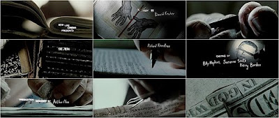
This opening sequence of 'Se7en' has parts if the trailer within it. The attention of the viewer is grabbed instantly, and this will help them want to know more about the plot. The opening sequence uses montage editing, however this is at a slow pace compared to fast paced editing which is the conventional pace for montage editing.

Se7en - Trailer


This is the trailer for the movie 'Se7en'. I believe this trailer is very effective, due to the fact that it is very fast paced; just as a trailer should be. Also, there is a vast amount of action, yet not giving any indication of the plot. The actors that are involved are shown to us, yet not showing any key information. Moreover, the voice over gives an indication about the film, and assists the viewer about the movie.

Monday, November 22, 2010

What Titles?

In an opening sequence of a film, there are many titles involved. Usually, the initial title that appears is the producers of the film. For example, 'Universal' is one of the producers for films, and the logo for this company will appear.

Moreover, the directors of the film will appear, followed by the editors and director; then lastly the name of the film. The way that the titles appear can associate with the genre of the movie, for example an action movie will have quick and sharp titles, whereas a Thriller would have slow and 'eerie' titles.

The titles of a film can also set the 'mood' and 'atmosphere' created, and again this can be done with genre of film it is, for example bold, and 'sharp' font could be associated with a Thriller movie, because it gives off those connotations.

The titles that are used within an opening sequence show who the characters are within the movie that the audience is about to watch. Another role is who the ‘Casting’ is by, and who the ‘Costume Designer’ us. Also, we are shown who the ‘music’ is by and who the ‘Editor’ is. In addition, we are shown who the ‘Production Designer’ is, and the ‘Director of Photography’ is in the film. We then see the ‘Executive Producer’ is, and then who it is ‘Produced’ by. Then, we lastly see who the film was ‘Written’ and ‘Directed’ by.


The Brief

The brief is to create the titles and opening of a new fiction film, to last a maximum of two minutes.

Tuesday, November 2, 2010

Peer Feedback For Preliminary Task

I found out that my peers thought my groups work was very good and original. They thought this, because of the use of very good continuity editing as well as the CCTV shot being 'original' and innovative. In addition to this, I was told that the use of various shots used were very good, such as high shot and low shot. Furthermore, our piece had a good use of 'match on action', eye line match and overall very good continuity editing. It was recommended by our peers , that we had a master shot before the dialogue to give the audience an insight as to what was going to happen, yet without spoiling it.

How will I use this in my next piece of film?
By receiving this feedback, I am now able to take this on board when creating my next film. I now know from my peers, that I could use a master shot just to give the audience an insight of what the film would be about. This will make my skills even better next time when creating a film, due to the peer feedback.