Monday, February 28, 2011

Who would be the audience for your media product?

The audience for my media product would be mainly for 15-25 year olds. This is because the main character shown is around them ages so they would be able to relate to him and become more engrossed as they would be able to picture themselves in the events that occurs. It is targeted at older teenagers as it may be slightly confusing for a younger person and and older teenagers may enjoy trying to figure out what is happening and what will happen to the main character as the film develops. The certification of the film would be a 15.

What kind of media institution might distribute your media product and why?


I believe that our movie might be distributed by either ‘Paramount Pictures’, ‘Hollywood Pictures’ or even 'Vertigo Films'. Firstly, the reason that I feel that ‘Hollywood Pictures’ could distribute our movie, is because they have produced similar genre movies to our movie, for example they have produced ‘The Sixth Sense’, ‘Shadow Conspiracy’ and ‘The Invisible’. This distributer is very well known, and I believe our movie will be a very big hit if they decide to distribute our movie, ‘Premonition’.
Moreover, the reason that I believe that ‘Paramount Pictures’ could distribute our movie, is due to the fact that, again this film distributer have produced similar genre movies to our movie ‘Premonition’. ‘Paramount Pictures’ have distributed the movie ‘Vertigo’ and this movie was very similar to our movie, as this movie is a physiological thriller; alike ours. For that reason, I feel that this film distributer would be perfect to distribute our movie, as the film ‘Vertigo’ was also a very popular.
Vertigo is another possible company that will produce and distribute our movie 'Premonition'. Due to the fact, that Vertigo Films are a british production company, and we felt that our movie should be produced by a completely british company; alike the movie 'The Business'.
Moreover, Vertigo Films have produced movies that are of a similar genre to our psychological-thriller movie 'Premonition', such as 'The Children', and 'Outcast'. These movies are interesting Thrillers, and they create a great impact on the audience that are watching. We want this element within our movie, and we wanted our movie to be different and stand out; similarly to these films. We have a modern turn on our film with different elements, and we believe that Vertigo Films are best suited to produce our movie 'Premonition'.

How does your media product represent particular social groups?

Within the first two minutes of our media product, the audience are only shown 'Damion', our main character of the movie 'Premonition'. 'Damion' represents stereotypes as he is young, blonde haired and blue eyed and seems quite a cheeky younge man'. He represents young, hard working men and this is represented through the use of the suit he wears in the opening sequence. To follow this representation when he wakes up he activly takes part in a younge mans typical 'everyday' activities, and these activities include eating breakfast, and getting dressed into his suit. These activities add to the fact that many people of his age group, which are our target audience, would do these activities. They would be able to relate to him, as he would be doing the same things as them.
Our media product, 'Premonition' also challenges many gender stereotypes, as the predominant character would be a female, and she would usually be the victim and targeted. The beginning of our movie was influenced by 'Alice in Wonderland', and our actor, Ryan Clark, who played 'Damion' is similar to the typical connotations of 'Alice' due to the blonde hair and the wearing of the colour blue. The stereotypes were challenged in our opening sequence, because we had the victim as a male, as apposed to a female.

In what ways does your media product use, develop or challenge forms and conventions of real media products?

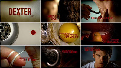
Our media product, Premonition was uses real media products as our project was influenced by ‘Dexter’. This is because we decided to film part of our opening sequence in a house, which was our main characters and we wanted everyday normal aspects of life to be made sinister and as if someone was possibly watching him. Moreover, the use of the knife scraping the butter was completed in such a way, that our intentions were to make the audience feel very uncomfortable, and ‘on edge’. We chose to use a house, because we wanted to challenge the idea that a house is a safe place. A house is associated with a safe place, yet we wanted the audience to watch an opening sequence that challenges this; that way even more of an eerie and sinister atmosphere will have been successfully created.
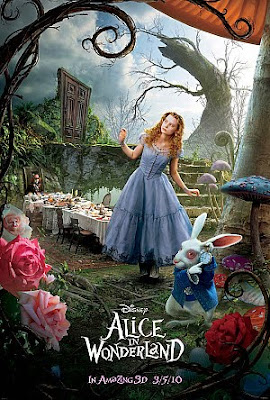

Also, we had a scene in the opening sequence which has the main character in the woods, and this part was influenced by the movie ‘Alice in Wonderland’. Alike this movie, we had clocks on trees, umbrellas and the males dressing gown in the woods area which shows the confusion and dream state which we wanted to demonstrate. Moreover, I believe we created the confusing atmosphere that we intended to create, and this was done with the use of the physical objects. Moreover, the colour blue was a common occurrence throughout our opening sequence and we wanted the audience to ask all sorts of questions. Questions such as why is this colour keep occurring, why are there all of these objects and why are they in these specific locations? This is the common convention for a Thriller genre opening sequence; therefore we wanted to uphold this.

Wednesday, February 9, 2011

Titles

This style of front is called 'Precosia', and the reason i chose this font is because it looks very original. The sharp looking edges will reflect the our movie is a Thriller. The sheer style of the font looks like a tattoo, and that then reflects the symbol that will be used in the film.


This style of text is called 'Obelisque', and the reason i had this text as an option is because it is very simplistic and this will contrast against our movie. The unsteady letters that are used, could connote Damiens unsteady mind and unsteady life, and this will reflect the charcater within the title.
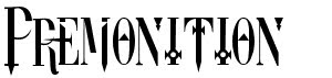

This style of font is called 'DreamScar' and this instantly relates to our film because of the name. This style of font has symbols within the letters, and a symbol is prime within the movie 'Premonition'. Again, the sharp looking letters connote a sense of danger in the film, and this is typical within this genre of film.

Saturday, February 5, 2011

Casting


We chose Ryan Clark to play Damien, which is the main character, as he is roughly an average height, innocent looking, yet he's not weak. He is dressed smart throughout the film to reflect his intelligent persona. Damien works as a clinical psychologist with a keen interest in Cognitive and Psychodynamic psychology, and this is the reason as to his interest in dreams. The character is of around 21 years old, and the audience are instantly 'fond' of him.

Thursday, February 3, 2011

Character Desciption


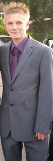
For our main character, Damien our group want him to be of a normal height and weight. We would like him to be roughly in his very early twenties, and we want him to wear a suit and a dressing gown in the opening sequence; this will make him look smart and professional. He should look smart and healthy like the male above. It will allow many men to be able to aspire to be like him, as well as find similarities between themselves and Damien. We want him to be imstantly liked, and just an all-round generally nice male character. Moreover, we want the audience to see this character as the 'hero' of the movie, and just generally really like him.

Wednesday, February 2, 2011

Shooting Schedule


This is our shooting schedule for our movie 'Premonition'. We will follow this schedule, in order to have our filming complete in time so our group are able to edit the opening sequence and make it the best and the most effective possible.

Script

Within our opening sequence of ‘Premonition’, as a group we decided not to have any dialogue. We felt that dialogue would distract the audience from watching the opening sequence, and the clever shots that were composed. As a group, we thought that dialogue would also have a poor affect on the surreal, and sinister atmosphere, which we wished to create. In order for the surrealism to be created, we wanted the audience to understand this by actually watching the opening sequence, and allow the shots used to convey this approach to a Thriller genre film, rather than dialogue to ‘tell’ the story. Moreover, our carefully conposed opening sequence, we felt would be ruined with the use of dialogue as Damien would have no one to actually talk to. Also, we felt that it would overtake our very well thought through shots and use of non - digetic sound, such as the keys, the fridge opening, and the toaster popping up the toast.

Tuesday, February 1, 2011

Props List


These are our groups location shots, and these are of Nonsuch Park in the woods. These shots are interesting angles, and the sharp twigs only emphasize the danger that is there. Also, the shot above makes it seem as if someone is hiding behind the tree, and this further creates an eerie atmosphere. The obscure composition of these shots meerly reflects the obscurity of the storyline itself, and this will make the opening sequence very interesting for the viewer to watch.


This image shows the blue colour scheme kitchen along with our other prop, the toaster. Blue was the main colour scheme of our movie, and these were to be used in the house scene.


This dressing gown is part of costume for the character of Damien, and again this is following the colour scheme of blue.

This prop is a red gift-box, and this prop is very important within the forest scene. The giftbox is used to introduce the symbol to our charcater Damien.


mao suitProps

For the first scene there will not be many props but the ones we do use will be important to the storyline. We want to have some clocks scattered around showing different times which hope to get the audience thinking that it is not real and is a dream. Another prop we will us in this scene is a small box that will have the symbol inside it. The second scene will use a lot more props as it is set in a home. The props that will be important to the story are a toilet, cup of tea, bread that will be toasted in a toaster and a knife and butter. Smaller props will include a set of keys, plates and other items that are around a normal home.

Costumes
There are two main costumes that the main actor will be wearing. The first one being a blue dressing gown which he will be wearing in him premonition and also while before he gets dressed in the next scene. We decided to put him in the dressing gown in both scenes to link the two scene together and to help to audience understand that the first half is a dream. The dressing gown will be blue as it is the main colour scheme. The other costume will be a grey suit which he will put on in the end of the second scene. The suit will show that the character may have a good job and cares about his appearance.

Locations
We thought very carefully to wear the film would be set and decided to set it first in a forest followed by a scene in a house. We decided to do this as it scored highly in our questionnaires we created in the research stage as well as linking well with the story and ideas we had as a group. We decided to set the forest scene in Nonsuch Park as it fit well with our ideas. For example we knew it had paths of which we can film up and many surrounding trees that will block out anything as well as creating an extra frame. The forest also create a sinister feel as many of the leaves will have fallen of the trees and it is also very quite and still. The second scene we decided will be set in Katie's house as it fit in well with our ideas of having blue as the main theme as the kitchen is blue themed.

Written by Gemma Flinders, photographs of props by Katie Lee, and photographs of Locations by James Sullivan.