Monday, May 9, 2011
Friday, May 6, 2011
Monday, February 28, 2011
Looking back at your preliminary task, what do you feel you have learnt in the progression from it to the full product?
In my opinion, I feel that I have learnt an awful lot since the preliminary task and this final product. The aspects, in which I have learnt the most, would be ‘eyeline match’ and how this creates such a great effect on a film. We decided to use this in our opening sequence of ‘Premonition’, as we felt that it would be very successful in our opening sequence, and we would be able to show off our skills within this area. Moreover, a big part to play in the learning from the preliminary task to the final product is continuity editing. I realised that this is the key aspect to creating a very believable and outstandingly well opening sequence to a movie and we took this on board because we wanted our opening sequence to be perfect. I have realised that continuity editing is crucial within a movie, and I really focused on getting it absolutely perfect. Moreover, since the preliminary task I have been able to understand the Thriller genre movie a lot more in depth. I was also able to distinguish the true meaning of a Thriller based movie, and the elements that are decisive within it, such as the slow paced editing, the slow resonant sound. Also, other aspects that are needed in the opening sequence are low lighting, and the audience need to be asking questions in their head; they need to be hooked and want to watch on and find out what is going to happen in the end. All of these play a key part in the success of a Thriller based opening sequence, and I made sure that we followed this as closely as possible in order for our opening sequence to successful. I have learnt all of these different aspects, and I now know a lot about Thriller genre movies and the different editing rules, as well as the aspects needed in which an opening sequence will be made triumphant.
What have you learnt about the technologies from the process of constructing this product?


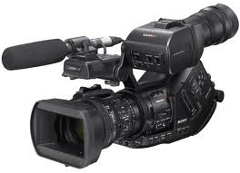
During the construction of this product, I have learnt many new technologies. Firstly using the video camera, before starting this process I have only minimalistic knowledge of using the video camera and the use of interesting shots within our film. Therefore using this steady cam was a first, as I had never used it before. Another technology that I used during the process of the construction of our movie ‘Premonition’ was the Macs and iMovie. I had very minimalistic knowledge of iMovie and the Macs, but as the process of making our opening sequence my skills using these technologies also developed. The first instance of trouble that our group came across was importing the footage into iMovie, and I very quickly learnt how to convert the footage so our group were able to import it into iMovie. Moreover, I very quickly learnt how to input transitions into our opening sequence as well as inputting sound effects from ‘freesound’.
Another technology that I used was ‘Live type’, and this was a piece of software in which we were able to input the footage into ‘Live type’ and make the titles for the opening sequence. ‘Live type’ was quite easy to use, apart from the fact that it was very temperamental to use; however it was very effective. This has now made our opening sequence of ‘Premonition’ very professional, and this process of constructing this product has made me very knowledgeable with these products.
How did you attract/address your audience?


Who would be the audience for your media product?
 The audience for my media product would be mainly for 15-25 year olds. This is because the main character shown is around them ages so they would be able to relate to him and become more engrossed as they would be able to picture themselves in the events that occurs. It is targeted at older teenagers as it may be slightly confusing for a younger person and and older teenagers may enjoy trying to figure out what is happening and what will happen to the main character as the film develops. The certification of the film would be a 15.
What kind of media institution might distribute your media product and why?
Moreover, the reason that I believe that ‘Paramount Pictures’ could distribute our movie, is due to the fact that, again this film distributer have produced similar genre movies to our movie ‘Premonition’. ‘Paramount Pictures’ have distributed the movie ‘Vertigo’ and this movie was very similar to our movie, as this movie is a physiological thriller; alike ours. For that reason, I feel that this film distributer would be perfect to distribute our movie, as the film ‘Vertigo’ was also a very popular.
How does your media product represent particular social groups?

 Our media product, 'Premonition' also challenges many gender stereotypes, as the predominant character would be a female, and she would usually be the victim and targeted. The beginning of our movie was influenced by 'Alice in Wonderland', and our actor, Ryan Clark, who played 'Damion' is similar to the typical connotations of 'Alice' due to the blonde hair and the wearing of the colour blue. The stereotypes were challenged in our opening sequence, because we had the victim as a male, as apposed to a female.
In what ways does your media product use, develop or challenge forms and conventions of real media products?
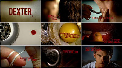
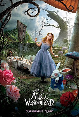
Also, we had a scene in the opening sequence which has the main character in the woods, and this part was influenced by the movie ‘Alice in Wonderland’. Alike this movie, we had clocks on trees, umbrellas and the males dressing gown in the woods area which shows the confusion and dream state which we wanted to demonstrate. Moreover, I believe we created the confusing atmosphere that we intended to create, and this was done with the use of the physical objects. Moreover, the colour blue was a common occurrence throughout our opening sequence and we wanted the audience to ask all sorts of questions. Questions such as why is this colour keep occurring, why are there all of these objects and why are they in these specific locations? This is the common convention for a Thriller genre opening sequence; therefore we wanted to uphold this.
Wednesday, February 9, 2011
Titles
 This style of front is called 'Precosia', and the reason i chose this font is because it looks very original. The sharp looking edges will reflect the our movie is a Thriller. The sheer style of the font looks like a tattoo, and that then reflects the symbol that will be used in the film.
 This style of text is called 'Obelisque', and the reason i had this text as an option is because it is very simplistic and this will contrast against our movie. The unsteady letters that are used, could connote Damiens unsteady mind and unsteady life, and this will reflect the charcater within the title.

This style of font is called 'DreamScar' and this instantly relates to our film because of the name. This style of font has symbols within the letters, and a symbol is prime within the movie 'Premonition'. Again, the sharp looking letters connote a sense of danger in the film, and this is typical within this genre of film.
Saturday, February 5, 2011
Casting
 We chose Ryan Clark to play Damien, which is the main character, as he is roughly an average height, innocent looking, yet he's not weak. He is dressed smart throughout the film to reflect his intelligent persona. Damien works as a clinical psychologist with a keen interest in Cognitive and Psychodynamic psychology, and this is the reason as to his interest in dreams. The character is of around 21 years old, and the audience are instantly 'fond' of him.
Thursday, February 3, 2011
Character Desciption

For our main character, Damien our group want him to be of a normal height and weight. We would like him to be roughly in his very early twenties, and we want him to wear a suit and a dressing gown in the opening sequence; this will make him look smart and professional. He should look smart and healthy like the male above. It will allow many men to be able to aspire to be like him, as well as find similarities between themselves and Damien. We want him to be imstantly liked, and just an all-round generally nice male character. Moreover, we want the audience to see this character as the 'hero' of the movie, and just generally really like him.
Wednesday, February 2, 2011
Shooting Schedule
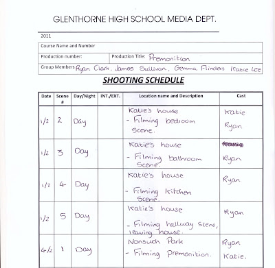
This is our shooting schedule for our movie 'Premonition'. We will follow this schedule, in order to have our filming complete in time so our group are able to edit the opening sequence and make it the best and the most effective possible.
Script
Within our opening sequence of ‘Premonition’, as a group we decided not to have any dialogue. We felt that dialogue would distract the audience from watching the opening sequence, and the clever shots that were composed. As a group, we thought that dialogue would also have a poor affect on the surreal, and sinister atmosphere, which we wished to create. In order for the surrealism to be created, we wanted the audience to understand this by actually watching the opening sequence, and allow the shots used to convey this approach to a Thriller genre film, rather than dialogue to ‘tell’ the story. Moreover, our carefully conposed opening sequence, we felt would be ruined with the use of dialogue as Damien would have no one to actually talk to. Also, we felt that it would overtake our very well thought through shots and use of non - digetic sound, such as the keys, the fridge opening, and the toaster popping up the toast.
Tuesday, February 1, 2011
Props List


These are our groups location shots, and these are of Nonsuch Park in the woods. These shots are interesting angles, and the sharp twigs only emphasize the danger that is there. Also, the shot above makes it seem as if someone is hiding behind the tree, and this further creates an eerie atmosphere. The obscure composition of these shots meerly reflects the obscurity of the storyline itself, and this will make the opening sequence very interesting for the viewer to watch.
 This image shows the blue colour scheme kitchen along with our other prop, the toaster. Blue was the main colour scheme of our movie, and these were to be used in the house scene.
This prop is a red gift-box, and this prop is very important within the forest scene. The giftbox is used to introduce the symbol to our charcater Damien.
For the first scene there will not be many props but the ones we do use will be important to the storyline. We want to have some clocks scattered around showing different times which hope to get the audience thinking that it is not real and is a dream. Another prop we will us in this scene is a small box that will have the symbol inside it. The second scene will use a lot more props as it is set in a home. The props that will be important to the story are a toilet, cup of tea, bread that will be toasted in a toaster and a knife and butter. Smaller props will include a set of keys, plates and other items that are around a normal home.
Costumes
There are two main costumes that the main actor will be wearing. The first one being a blue dressing gown which he will be wearing in him premonition and also while before he gets dressed in the next scene. We decided to put him in the dressing gown in both scenes to link the two scene together and to help to audience understand that the first half is a dream. The dressing gown will be blue as it is the main colour scheme. The other costume will be a grey suit which he will put on in the end of the second scene. The suit will show that the character may have a good job and cares about his appearance.
Locations
We thought very carefully to wear the film would be set and decided to set it first in a forest followed by a scene in a house. We decided to do this as it scored highly in our questionnaires we created in the research stage as well as linking well with the story and ideas we had as a group. We decided to set the forest scene in Nonsuch Park as it fit well with our ideas. For example we knew it had paths of which we can film up and many surrounding trees that will block out anything as well as creating an extra frame. The forest also create a sinister feel as many of the leaves will have fallen of the trees and it is also very quite and still. The second scene we decided will be set in Katie's house as it fit in well with our ideas of having blue as the main theme as the kitchen is blue themed.
Written by Gemma Flinders, photographs of props by Katie Lee, and photographs of Locations by James Sullivan.
Sunday, January 30, 2011
Storyboard


This is our storyboard that we created for our movie, 'Premonition'. We wish to follow this storyboard so the opening sequence will look effective, However, when we actually start to film we might not completely follow this storyboard just incase the shot doesn't look right; but we will try and follow it as much as possible.
Friday, January 28, 2011
Sound
The second scene will have completely different music, emphasizing the fact that the first scene is a dream and the next scene is a normal day. Similar to the first scene we have thought about adding sounds over the top of the clips, and this will be during the editing stage. An example would be making the toaster have an exagerated sound. As a group we decided to not include any dialogue in these scenes, due to the fact that we wanted their soul focus to be on what is happening within the frame and make sure there are no destractions.
This is an example of sound we could possibly use in our movie.
http://www.freesound.org/samplesViewSingle.php?id=15396
We may use a diegetic sound similar to this for the scene which involves toast being ejected from the toaster. This is because we discussed how this would work during filming, and came to the conclusion that the sound picked up by the camera from our toaster wouldn't be as effective and 'strong' as putting a soundtrack over it.
Thursday, January 27, 2011
Shot Lists
Premonition
Shot number: | Brief description of the action (what is going to happen in this shot?) | Description of Shot Type and Camera Movement |
1 | Leaves will be within the frame and it will be leading up to Damien. | Tracking, close up. A fig rig will be used to keep the shot steady. |
2 | Damien’s eyes open, he looks around the setting at which he is placed. | Panning, and long shot. This will show the audience where he is. |
3 | The audience is shown the symbol that is in the giftbox. | This will be a close up, and it will be an over the sholder shot. |
4 | Damien will then use toilet. | This will be a long shot, but only of the bottom of his legs, and then a close up of him flushing the toilet. |
5 | Damien opens up the fridge. | This shot will have the camera in the fridge itself. |
6 | This will be a mid shot/close up of the toaster and toast. Then a close up of him buttering the toast and then eating it. | |
7 | Damien gets dressed for work. | Panning up Damien, and it will also be a long shot |
8 | Lastly, Damien will leave the house. | Steady long-shot behind him opening the door, then following continuity a long-shot of him leaving the house with the camera in front of him. |
Wednesday, January 26, 2011
Film Synopsis - Premonition
 Premonition:
Our main character, Damien, has continuous premonitions in his dreams involving specific reference to a symbol (pictured to the right).
As these dreams become increasingly frequent and vivid, Damien becomes fascinated by this symbol and makes it his own business to find out what it means within the real world. The symbol is on advertisements, clothing and other manufactured products and although it seems to go unnoticed, Damien realises that people are becoming emotionally affiliated with it. As well as this, he also faces troubles at home when his girlfriend begins to turn against him.
Damien's intense research into the symbol produces no deep results and is he is kickstarted into physical action when he discovers a tattoo of the symbol on his girlfriend's neck while she sleeps thus explaining the way she's been acting.
The next month Damien spends examining the REM of his girlfriend in order to discover as much information as possible, the name of a man is repeatedly evident. He tries to find the man to no avail and later realises the man only exists in dreams/premonitions. People in the world around all seem to be becoming brainwashed by the symbol and eventually people are spending 23 hours a day asleep - the only place they can see their Master.
Damien finds out that if he applies pressure to the tattoo on his girlfriend's neck it allows him to intercept her dream, he there interrupts a meeting with the organisation and its followers with the intention to kill the master...
Tuesday, January 25, 2011
Initial Ideas
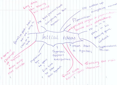 The main idea for the whole opening sequence is that it will be set in two scenes. The first being a forest scene, which portrays our character having a strange dream (premonition) involving a strange symbol. The second scene being a scene filmed in a house, showing the main character Damien getting ready to go to work, just like any other normal day.
We put down some ideas about Cinematography, and we have decided to use a tilted angle for some scenes to portray our vision of a premonition, and they would then be obscure. Also, we would have close up shots, to make the audience seem closer to the charcter, and his actions which will make our film more sinister. Our inspiration for this was the opening sequence of a popular television programme named 'Dexter'.
We also discussed ideas for the Mise en Scene of our film, deciding on bed clothes for our main male character and a prodominently blue and neutral colour scheme. This colour scheme will be reflected by both costume and prop, for example, blue dressing gown, and the blue gift box. In the first forest scene, we will use a lot of clocks to connote the idea of time running out, and to further portray a sense of eeriness and obscurity. The forest scene will be filmed in Nonsuch park as during some of our location research we discovered that this forest best fits our ideas as it has lots of trees and is potentially eerie. The second scene, which was influenced by 'Dexter', will be filmed in Katie's home as her house is very easy to get to, and she has a neutral colour scheme throughout and a blue kitchen. We decided on a house scene as the analysing of our questionnaire results during the research stage, showed that the idea of a house setting was popular with our audience.
For editing and sound, a kay idea was a low resonant sound during the 'dream' forest scene to further connote the idea of something not being 'the norm' and this will create further tension in our opening sequence. At the moment, our ideas for titles is to use bold font in blue along with the scene in the house, but the name of the film 'Premonition' will appear on its own on a black background between the forest scene and the house scene. At the end of the house scene to depict a symbol appearing on the back of a door, we will use a shot of the blank door and then a shot of the door with the symbol using a cross fade to make the sequencr 'flow' between the shots and give a supernatural, magical effect to the opening sequence. We also discussed using a 'zoom' sound whenever the symbol is seen or appears, ant this will then be known by the audience if there is ever going to be the symbol, this soundtrack will play so they get an incling that the symbol is going to appear, and possibly something bad will happen.
Thursday, January 13, 2011
Audience Research 2
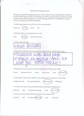
In the group that we are in, we created a questionnaire in which we hoped that people would take time to fill out in relation to us creating our Thriller opening sequence. I had the same age group fill out the questionnaire, which was the 15 - 18 age group; this is the type of age group that are targeted for out Thriller opening sequence.
What type of characters do you expect to come across in a Thriller genre film?
- Mysterious type character
- Supernatural type charcter
- Female in destress
- A male which is a 'Hero'
- A victim
- Eerie character
- A character with a split personality
What type of location do you find most fitting with a Thriller genre film?
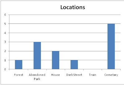

I intend to use this information to adapt how we create our thriller opening sequence in order to appeal to our target audience.
We will try to find an effective way to film our thriller but mainly in a home setting, I believe people may find this an interesting setting for a thriller because they would be able to relate to it on a more personal level rather than a cemetery. Thsi is because Thriller's are usuall filmed with a cemetery scene to create the eerie atmosphere; however we feel that in a home it will create an even more eerie atmosphere.
Whils planning,our group has discussed how we could approach the openign sequence and have considered perhaps filming a sequence of close-up shots showing a man getting ready on his way to work, making something very normal seem quite sinister. This was inspired by the opening sequence of an episode of 'Dexter'.
Wednesday, January 12, 2011
Audience Research 1
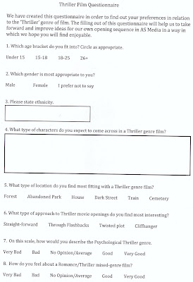
This is my groups questionnaire, and we fee that this is going to give us some indication as to the type of opening sequence that we could make. This is including the types of characters, the location and the type of Thriller. We will use the results from the questionnaire to create our film.
Monday, January 10, 2011
Wallander - Opening Sequence Analysis
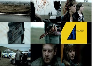
The title of the film:
The title of this film is ‘Wallander’ which is based on a male named ‘Kurt Wallander’ who is a fictional police inspector of books and films. We first see the title appear about a minute into the opening sequence on a yellow screen, and this makes up the word ‘Wallander’. The actor is within the gaps in the word, this could possibly be showing that he has a split personality.
How the setting/location is revealed:
Firstly we see the sea, and then the camera goes towards the mainland where we see the predominant colour of green, and then a parked car which has to figures walking away from it. The audience wants to know why this car is parked in the middle of nowhere, and why these two people are walking away from it. This is really effective, because the music cuts us from the clip of the establishing shot, straight to the girls walking and the music helps create the atmosphere. Possibly, showing something has happened quite quickly, and hastily.
Costumes/props:
The two girls are presented to the audience covered in blood and they look quite dirty. Both of the girls have clearly been involved in an awful situation because of the blood present on them, and they look as if they have been in some sort of scuffle. Also, one of the girls is holding a knife covered in blood, so we instantly know that they have stabbed someone, but we want to know who, and why.
Camera work/editing:
The opening sequence I believe is excellent, as the camera is clearly fixed to a helicopter as it is flying over the land from the sea, and we have this illusion that we are getting to the crime scene. We then cut straight into a close up of the two girls faces as they walk away from the taxi. Additionally, we see lots of close ups in the taxi of blood squirted everywhere, and the man finger moves; we then have some hope for him and hope he will be okay.
Title and font style:
This movie does not use the tradition bold and simple font, instead yellow, sharp, pointy, loud font is used. The pointy fonts, resembles the sharp knife which was the murder weapon. Also, we see the main chatterers face within the gaps in the font, and again this is possibly because he has a split personality. I feel this is brilliant, as it is very unique and the text is bold and in your face; making the audience want to watch on.
How the opening sets the story:
Well the audience establishes that the two girls have clearly stabbed the male in the taxi, as they are holding a knife which is covered in blood, and the car’s interior is covered in squirted blood. We then find out that the two girls killed this man just for money, because they simply needed it. The audience will then find out why they had did this, because at the moment it is all very confusing as to why they would.
How does this movie suggest that it’s a Thriller:
The opening sequence could suggest that it’s a thriller, with the use of the quick cuts between clips, and the fact that there is a knife present; moreover that there is blood everywhere. Also, the beginning titles that look very pointy and sharp, give some indication that this is a thriller, purely because we associate pointy sharp edges, with knives and dangerous objects.
The characters introduced:
In the opening sequence we meet two girls, and they have killed a taxi driver purely for the need of money. We want to know why they have done this, and what the sole purpose was. Further on into the opening sequence we meet a police inspector, who believes that the girls have killed for another reason he just needs to prove it. The audience then wants to work it out with the inspector why they have done this awful crime.
Special effects:
The only special effects that were primarily used, was within the titles. Just for the reason that the titles looked very intricate, and detail as they have the males face amongst them. Apart from that, I don’t believe there were any special effects that were used in the movie itself.
Kiss Me Deadly - Opening Sequence Analysis
The title of the film:
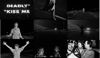
The title of this movie is ‘Kiss Me Deadly’, and we see the title appear on the screen just after we see a female running and abruptly stopping a car in the middle of the road; causing ait to swerve and stop. After that, we have the camera within the car, and then we can see them quite personally. The title is central within the frame, but it then scrolls up the screen, making the audience seem as if it was the end of the film.
How the setting/location is revealed:
The audience gets to see a long shot of a woman running down a vacant road, we see her ‘flagging’ down cars to ask for help, and we wonder why. The road is very long, suggesting that she was in the middle of nowhere, surrounded by long grass and trees. We want to know why she is on this road, and where she has come from.
Costumes/props:
When the woman first appears on the screen we see that she is quite young with very short, and what appears to be blonde hair, and the only thing that she is wearing is a lightly coloured trench coat. This female character isn’t wearing any shoes or any other form of clothing, only this long coat. This could be implying to the audience that she is running away from something, or someone yet we don’t know what or who; we want to watch on and find out who and why. Also, the man in the car looks very formal and upper class, by the coat and clothes he is wearing.
Camera work/editing:
During the opening sequence there are many different shots and angles used effectively. Firstly, the unusual usage of the mid shot works very well as it shows a woman’s legs running barefoot, and this was our main focus within the frame, so we can see the sheer panic she must be feeling. But also we could see that she must have been in a furry to go out with no shoes. This immediately will make the viewer question what has happened to her and why is she running. Also, an over the shoulder shot is used when the male and female characters are in the car, shows that we are quite close to them and we want to know why she has been running.
Title and font style:
We can see from the titles of this movie, ‘Kiss Me Deadly’, has the usual bold, simple font which again creates a big impact. It is very simplistic, but again I feel this is done to calm the viewer down for what is going to actually take place in the film. The font is in a grey/ white colour which is quite natural, therefore giving nothing away about the movie.
How the opening sets the story:
The story is set in a car of man and he has picked up the scared and worried woman who was running away from something or someone, when they come to a certain point of the journey police stop them and as if they have seen a woman. The audience find out that the woman in the car has run away from an institution, and that the man has now lied to the police to help this woman; however he was unaware of this. This works well as the viewer finds out some information about the woman but not a lot is given away, we want to know why she was there and why she had run away.
How does the movie suggest that it’s a Thriller:
The opening sequence could suggest that this film is a thriller, by the usage of the quick cuts of different shots, and this is because a Thriller could be quite fast paced, such as a murderer’s thoughts and mentality is fast paced so there is a link between the two. Also, in the opening there is a lot of shadowing making it very creepy for the viewer, but also the black and white merely adds to the eerie effect created.
The characters introduced:
The opening sequence introduces the audience to two characters. The female is first seen running away in panic from the unknown, and we want to know why she is running immediately. Secondly, we meet the male who is stopped by the woman quite unexpectedly. He helps this woman, by letting her in his car and he takes her to where she needs to go, but as the journey progresses he finds out where she has run; furthermore so do the audience.
Special effects:
Special effects was very minimalistic, I don’t feel that any were used in the movie ‘Kiss Me Deadly’, purely due to the era that this movie was created. However, the lack of special effects does the film justice, as the whole experience seems real and natural; we are able to ‘sink’ further into the film and not get sidetracked.
Double Indemnity - Opening Sequence Analysis

The title of the film:
The title of the film is ‘Double indemnity’, and at first we see that the film is in black and white, seeing that the film is ‘old’. The use of the black and white, creates a creepy atmosphere as you are able to see smoke and dust a lot better; giving a ,ore creepy feel to it. We see a silhouette of a man on crutches walking towards us, and this relates to the title as it is all about money; he was harmed for whatever reason. The title is clearly seen by the viewer, as it is in bold letter in the centre of the frame.
How the setting/location is revealed:
We are able to see an establishing shot of a main road, with road signs, the sign says ‘Los Angeles’, so we are able to depict that this movie is set in Los Angeles. It is currently at night because of the darkness, and this adds to the creepy effect within the movie; as most crimes are committed at night and that is when it is most haunting.
Costumes/props:
The man who we see firstly we believe to be the predominant character, is in a suit with a long black trench coat and a trilby hat; looking very formal. I believe this says a lot about his character, and we can instantly know a little bit about him. We see this male holding a gun, and this prop is very common amongst thriller movies, the audience will automatically have questions that they want answered such as why he has the gun, what is he going to do with it, all these questions we want answered. Another prop is the car driving very swiftly and out of control, additionally the audience wants to know this car is driving in this manner.
Camera work/editing:
During the opening sequence we see the titles, and these consist of who was within the construction of the movie. The male character appears to be walking towards us which is very clever, we want to know why he is on crutches; also who done it to him. Furthermore, the long shot of the office is really effective, in my opinion, as we are able to see the sheer amount of workers that work they; due to the deserted desks in the shot.
Title and font style:
Traditionally in thriller opening sequences we see the traditional use of bold and simple font that is central in the frame, and I feel this creates a much bigger impact. The simple text makes the viewer feel relaxed just before they watch the movie, because we know that through a thriller movie the audience will not be relaxed.
How the opening sets the story:
Firstly we see a man driving erratically through the road of Los Angeles, and then he pulls up outside of a vast building. We then see the man go up in a lift to the office which he works at, and we are unable to see his face very often, possibly to make the audience wonder why we are unable to see his face. We will then watch on, and the mystery will unravel.
How does it suggest that it’s a thriller:
The opening sequence could suggest that the film is a thriller, with the use of blacks and whites as these colours will be seen as haunting. Also, the music in the opening sequence makes out the film is going to be a thriller as it’s very sinister and builds a lot of tension for the viewer; possibly making them sit on the edge of their seat.
The characters introduced:
In the opening sequence we meet the driver of the car, and we find out that his name is Mr Neff, and we learn that he is an important member of the company, possibly a manager. This could be thought due to the fact that he has his own office, and it is higher up than the workers little desks.
Special effects:
In ‘Double Indemnity’ the opening sequence I feel doesn’t have very many special effects used, it is just simple camera work. The only special effects that could be used were to assist the car in driving so fast around the streets.
Sunday, January 9, 2011
Brick - Opening Sequence Analysis
The title of the film:
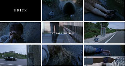
The title of the film is ‘Brick’ and it appears on the screen after we see the scene within the school, this is also when we see the beginning of the movie; it’s a quick cut into the title. The text is central within the frame, and there is a black background. Also, when the title appears on the screen there is a sudden stop in music, this could possibly connote an abrupt end to the female’s life.
The way the setting/location is revealed:
Firstly, we see a close ups of the scene and this is mainly of a male character, making the audience wonder where this film is set but also why he is there. It then cuts to an establishing shot of the setting where these characters are situated. The audience sees a long and vast drain pipe and in front of it is a male kneeling over a dead female. We want to know why this has happened, and who murdered the girl, but then we see the same male character in a phone box talking to a female that sounded distraught; we then believe she was in the vehicle that drove quite ecstatic past him.
Costumes/props:
The costumes from the opening sequence seems to be very casual, everyday clothes however when we get the close up of the deceased girl we see that she is wearing a skit, along with high heel shoes; this shows that she must have been out or going out and something tragic happened to her, clearly it was unexpected. We are able to see her bracelets that she was wearing, suggesting that she was quite a young girl. Lastly, towards the end of the opening sequence we have a close up of a finished cigarette with a red arrow on it. This will make the audience wonder what this means, and what is the significance of this.
Camera work/editing:
I feel the establishing shot of the drain pipe is successful, and we will wonder the significance of this drain pipe, but also we see both characters on either side in the front of the pipe; possibly suggesting the divide between these characters, and having the drain pipe being so big, there is a big divide between these characters, we then wonder why. There are many close ups used to build tension for the audience, making them feel uncomfortable and curious as they will see such detail of this girl, showing us that she was very young. We want to know what happened to this poor girl; but most importantly why it happened.
Title and font style:
The main title in all of the opening sequence is the title of the film ‘Brick’, it is in capital letter, and this could possibly show that the film contrasts with the font. The font is simple, yet the film may not be. We are giving a sense of a plot and storyline, and we will know why what happened did happen, being that the girl was murdered, due to the fact that it simply says ‘2 days previous’. It also makes the movie seem a little ‘detective’ like, and the viewer is solving a mystery.
How the opening sets the story:
The story is mainly set when we see an establishing shot of the drain, accompanied by the male and female characters. There is an establishing shot of an empty road with a phone box, sets the scene as the audience will wonder if they will find out whether this might link to what they saw previously.
How does it suggest that it’s a thriller:
The opening sequence can suggest that the film is going to be a thriller, because we see a gloomy place with a dead girl in it; conveying a creepy and tense atmosphere. Another aspect is that the music gets louder and louder, creating an even tenser atmosphere. Also, when the male character is on the phone to the female character, we hear something about a ‘Brick’, and then we notice that is the name of the film so it must have a lot of significance. A car drives very fast this male, and we believe that the female might be in this car, we want to know where is it going and why she might be in it.
The characters introduced:
From the first few shots we see close ups of two characters, which are believed to be the main characters. We see a dead girl, and that is all we see of her, mainly close up of her features, we want to know how she got there and why she’s dead. Also, the male seems to be terrified and upset about his girl, possible he knew her and they were very close. From the opening sequence we learn that both characters are young as they go to school, and they are both seen in the school, but also her blue bracelets are in her locker whilst at school.
Special effects:
I believe that in the opening sequence of ‘Brick’ there is a very minimalistic amount of editing, this could possibly have been done so that the audience will see that this movie is as real life as possible, to add to the creepy atmosphere. However, I feel that the throwing of the cigarette butt, and the way it landed had the use of special effects within it, just to make it perfect; I believe that was done very cleverly.


