The title of the film:
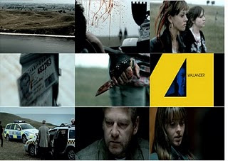
The title of this film is ‘Wallander’ which is based on a male named ‘Kurt Wallander’ who is a fictional police inspector of books and films. We first see the title appear about a minute into the opening sequence on a yellow screen, and this makes up the word ‘Wallander’. The actor is within the gaps in the word, this could possibly be showing that he has a split personality.
How the setting/location is revealed:
Firstly we see the sea, and then the camera goes towards the mainland where we see the predominant colour of green, and then a parked car which has to figures walking away from it. The audience wants to know why this car is parked in the middle of nowhere, and why these two people are walking away from it. This is really effective, because the music cuts us from the clip of the establishing shot, straight to the girls walking and the music helps create the atmosphere. Possibly, showing something has happened quite quickly, and hastily.
Costumes/props:
The two girls are presented to the audience covered in blood and they look quite dirty. Both of the girls have clearly been involved in an awful situation because of the blood present on them, and they look as if they have been in some sort of scuffle. Also, one of the girls is holding a knife covered in blood, so we instantly know that they have stabbed someone, but we want to know who, and why.
Camera work/editing:
The opening sequence I believe is excellent, as the camera is clearly fixed to a helicopter as it is flying over the land from the sea, and we have this illusion that we are getting to the crime scene. We then cut straight into a close up of the two girls faces as they walk away from the taxi. Additionally, we see lots of close ups in the taxi of blood squirted everywhere, and the man finger moves; we then have some hope for him and hope he will be okay.
Title and font style:
This movie does not use the tradition bold and simple font, instead yellow, sharp, pointy, loud font is used. The pointy fonts, resembles the sharp knife which was the murder weapon. Also, we see the main chatterers face within the gaps in the font, and again this is possibly because he has a split personality. I feel this is brilliant, as it is very unique and the text is bold and in your face; making the audience want to watch on.
How the opening sets the story:
Well the audience establishes that the two girls have clearly stabbed the male in the taxi, as they are holding a knife which is covered in blood, and the car’s interior is covered in squirted blood. We then find out that the two girls killed this man just for money, because they simply needed it. The audience will then find out why they had did this, because at the moment it is all very confusing as to why they would.
How does this movie suggest that it’s a Thriller:
The opening sequence could suggest that it’s a thriller, with the use of the quick cuts between clips, and the fact that there is a knife present; moreover that there is blood everywhere. Also, the beginning titles that look very pointy and sharp, give some indication that this is a thriller, purely because we associate pointy sharp edges, with knives and dangerous objects.
The characters introduced:
In the opening sequence we meet two girls, and they have killed a taxi driver purely for the need of money. We want to know why they have done this, and what the sole purpose was. Further on into the opening sequence we meet a police inspector, who believes that the girls have killed for another reason he just needs to prove it. The audience then wants to work it out with the inspector why they have done this awful crime.
Special effects:
The only special effects that were primarily used, was within the titles. Just for the reason that the titles looked very intricate, and detail as they have the males face amongst them. Apart from that, I don’t believe there were any special effects that were used in the movie itself.
Great to see that you have invested lots of time, thought and effort in the completion of your opening sequence analytical posts James. The contact sheets look realy good and your written notes really show careful thinking about how and why each opening sequence works. You show thoughtful ideas about the types of Q's the sequence raises, and the little clues we are given.
ReplyDeleteIt's a good idea in future contact sheets you create to number each shot and make specific references to these in your written analysis. This shows that you are carefully thinking and understanding HOW a sequence is constructed - shot by shot. It's great then for you to show use your grasp of media technical terms by almost zooming in on a particular shot and carefully analysing HOW it has been composed, and labelling the shot type, etc.
SJA Jan 19th